
Shell anatomy — named areas
This is a guide, not the contract. What the platform guarantees is specified under
openspec/specs/. For this page:shell-layout·panes. Where this page and a specification disagree, the specification is right, and that is a defect in this page: change the behaviour there, then explain it here.
Purpose: binding names for the visible shell areas, so conversations, code and docs mean the same thing. It is the spatial sketch for the region-type vocabulary from Building a distribution. The frame itself is neutral core chrome, and plugins contribute the contents.
This page names every visible area of the workbench and draws where it sits, so that a conversation, a region id in code and a sentence in these guides all mean the same area.
Base layout (desktop, fully equipped)
The top band is not one continuous bar across the edges, but three segments side by side at the same height, which together read like one bar from left to right: the sidebar headers on the left and right, the bar (top) in the middle.
+----------------+---------------------------+----------------+| Sidebar header | Bar (top) | Sidebar header | <- top band| (left) | start · center · end | (right) | (one height)| View tabs + | Logo · Language · Theme | View tabs + || Collapse | | Collapse |+-------+--------+---------------------------+--------+-------+| | | | | || RAIL | PANEL | CONTENT AREA | PANEL | RAIL ||(left) |(left) | (center) |(right) |(right,|| | | | | opt.) || Rail | View | tabs | View | || items | header | body | header | Rail ||(cmds) | +body | | +body | items |+-------+--------+---------------------------+--------+-------+| Bar (bottom) — status bar | <- bottom band| start · center · end |+-------------------------------------------------------------+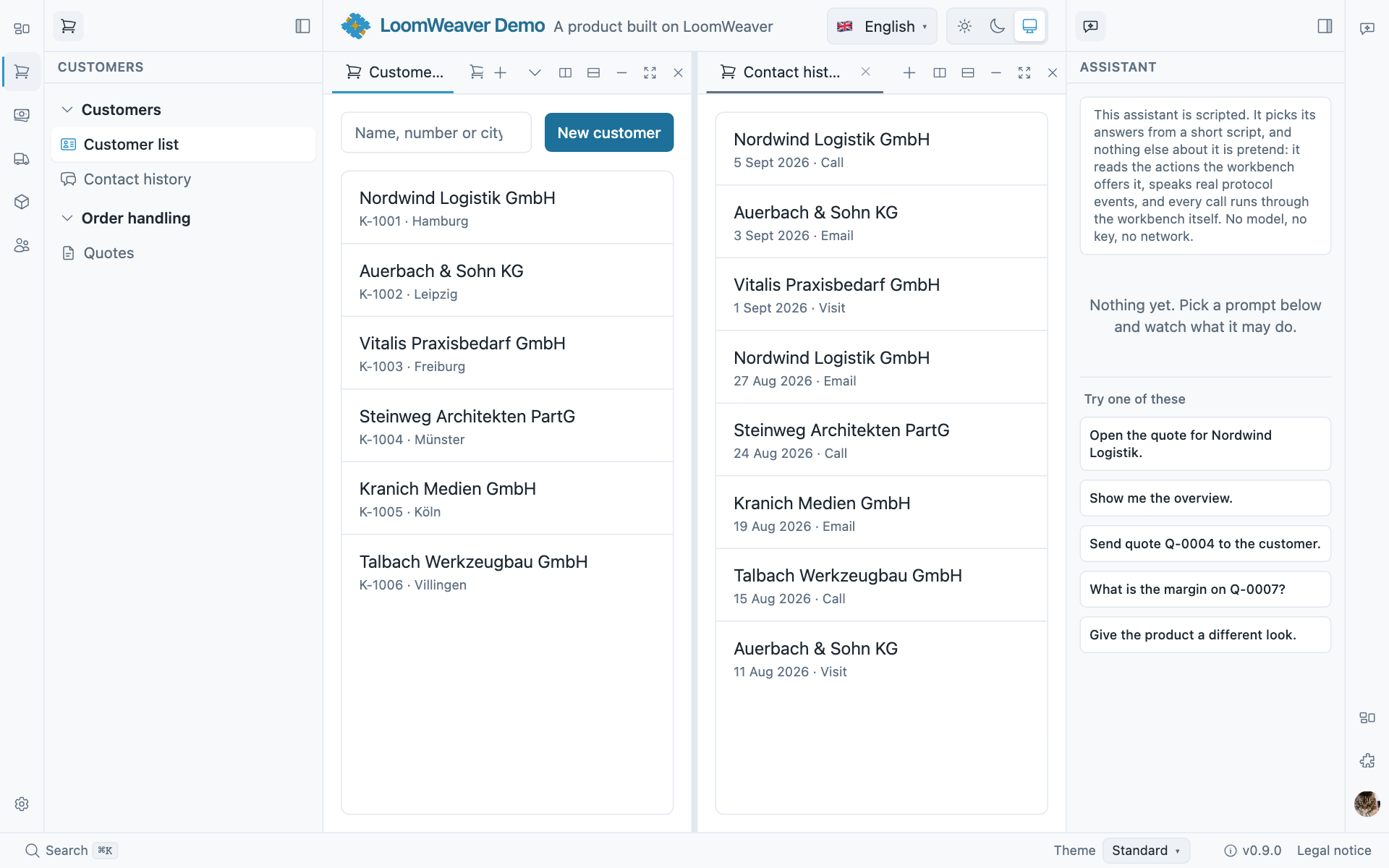
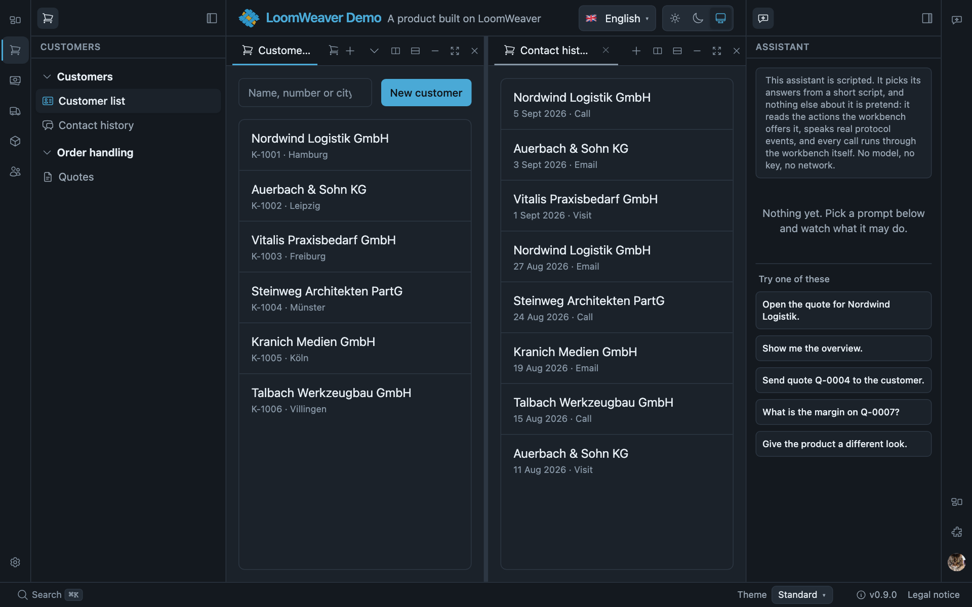
The same areas in the demo, with the content area split into two panes: rail and panel on the left, the bar across the top, a second panel on the right, the status bar along the bottom.
Names (glossary)
| Area in the sketch | Canonical name | Region type / code | Role | Sub-slots |
|---|---|---|---|---|
| Top middle segment | Bar (top) (colloquially “header”) | bar, dock top — e.g. { id: 'top-bar' } | brand/tool strip above the content | start · center · end → bar items |
| Strip above rail+panel (left/right) | Sidebar header | ShellSidebarHeader (part of the sidebar) | view switching + collapse/expand | view tabs (automatic) · collapse |
| Outer icon strip | Rail (ribbon) | rail, dock left/right | independent commands (not view switching), and workspace entries via workspace: <id>; user-curated, each entry in exactly one rail | anchor: 'top' | 'bottom' + order → rail items |
| Collapsible side area | Panel | panel, dock left/right | a tab group like the centre: icon tab strip (in the sidebar header) + active tab in the body; further groups below it can be split/stacked | header.title · header.actions · body |
| Rail + panel + sidebar header together | Sidebar | (composition) | one complete side bar | — |
| Main area (centre) | Content area | content, dock center | main working surface | tabs · body |
| Bottom strip | Bar (bottom) / status bar | bar, dock bottom — e.g. { id: 'status-bar' } | status/info | start · center · end → bar items |
| Contents of a sidebar | Surface | ctx.registerSurface (plugin; the only authoring entry point — View is only the host’s internal storage form) | title · icon · header.actions · body | — |
Rule of thumb: rail = global commands · sidebar-header tabs = view switching · view header = functions of the active view. The bar is neutral core chrome; its items are contributions (brand/language/theme are only the defaults, not wiring).
Only a workspace entry is ever marked as current. A rail entry carrying workspace: <id> is
highlighted while that workspace is active. An entry carrying a command is not, not even while the
address its command opened is the one on screen, because a command may do anything and the host
cannot tell what “being there” would mean for it. An entry meant to read as a place the user is in
therefore belongs to a workspace; a command entry reads as an action, and looks like one.
The region ids the scaffold declares
A weaver targets a region by its id (rail: 'primary', region: 'left-panel'). The ids are the
distribution’s to choose; the scaffold declares these six, and the guides use them:
| Id | Type | Dock | What it is |
|---|---|---|---|
top-bar | bar | top | the top bar: brand, tools, language and theme by default |
primary | rail | left | the left rail: command triggers and workspace entries |
left-panel | panel | left | the left sidebar’s tab group |
right-panel | panel | right | the right sidebar’s tab group |
main | content | center | the content area |
status-bar | bar | bottom | the status bar |
A distribution with other ids works the same way; only the names in the weaver’s declarations change.
Variant: no middle segment (bar (top) omitted)
If a distribution declares no top bar (no logo, no switchers), the top band does not
disappear. The sidebar headers remain (the width of rail+panel), and in the middle the
content moves up and uses the full height. The bar justifies itself through its contents:
no contents → no middle bar → more content height.
+-------+--------+---------------------------+--------+-------+| Sidebar header | | Sidebar header |+-------+--------+ +--------+-------+| RAIL | PANEL | CONTENT AREA | PANEL | RAIL || | | (uses the full height) | | |+-------+--------+---------------------------+--------+-------+Every edge is optional in the same way: with no sidebars the content expands into them; with no bottom bar there is no status line.
Compact / mobile (< md, 768px)
Below the md breakpoint the panels become overlay drawers (they slide over the content, with a
scrim), the rails stay visible, and the content gets the full width. Each sidebar is
opened/closed through the affordance in its sidebar header. The breakpoint is one fact,
ViewportService.compact, a signal the chrome reads and a distribution may read too, so that a
control of your own folds at the same width as the shell’s.
See also
- Building a distribution → Layout: regions & docks: how a distribution declares these regions (
provideLayout). - Authoring a weaver → Rail & bar items and Panel surfaces: how a weaver hooks views/items into these regions, with the slot/anchor properties in use.